
.png)

The NoahFace App displays different screens for different business applications. You can select one of the following screen types:
Once you have selected a screen type, you can further configure the screen by specifying appropriate screen details. The sections below explain the available options and syntax for each type of screen.
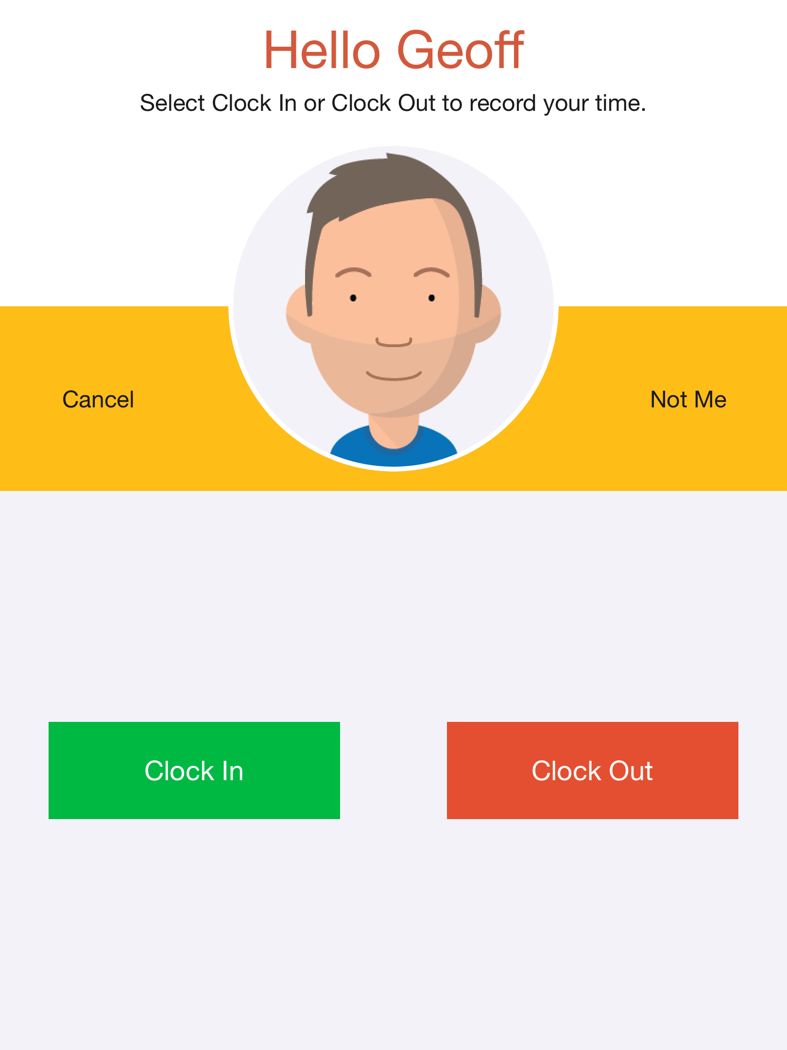
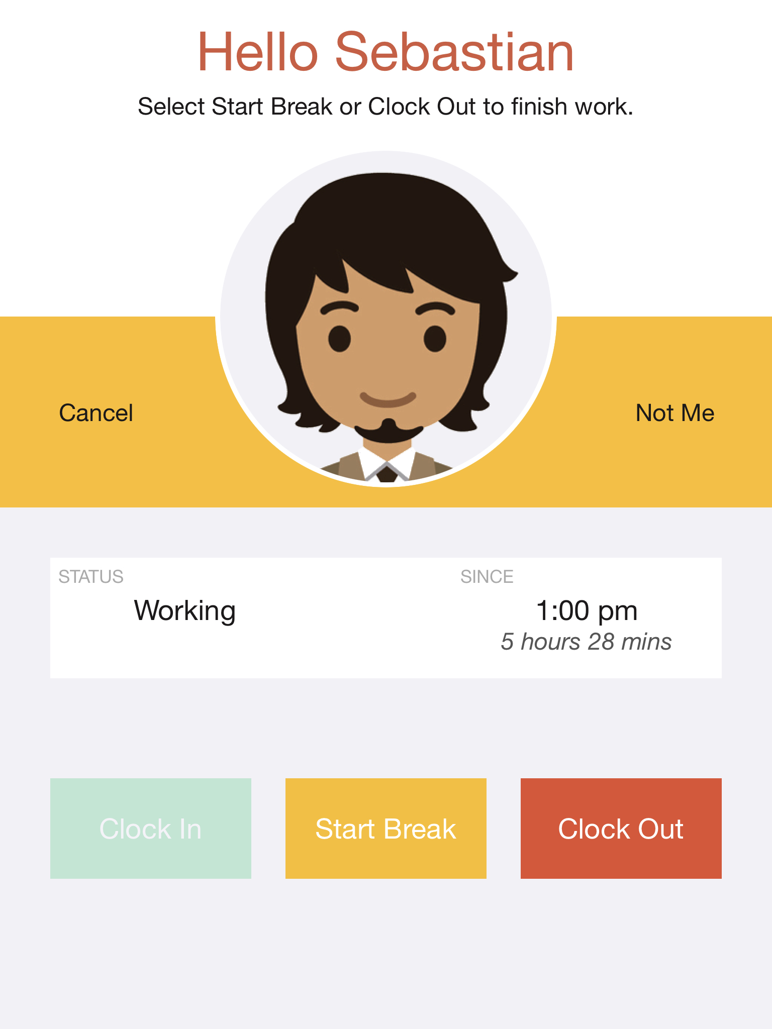
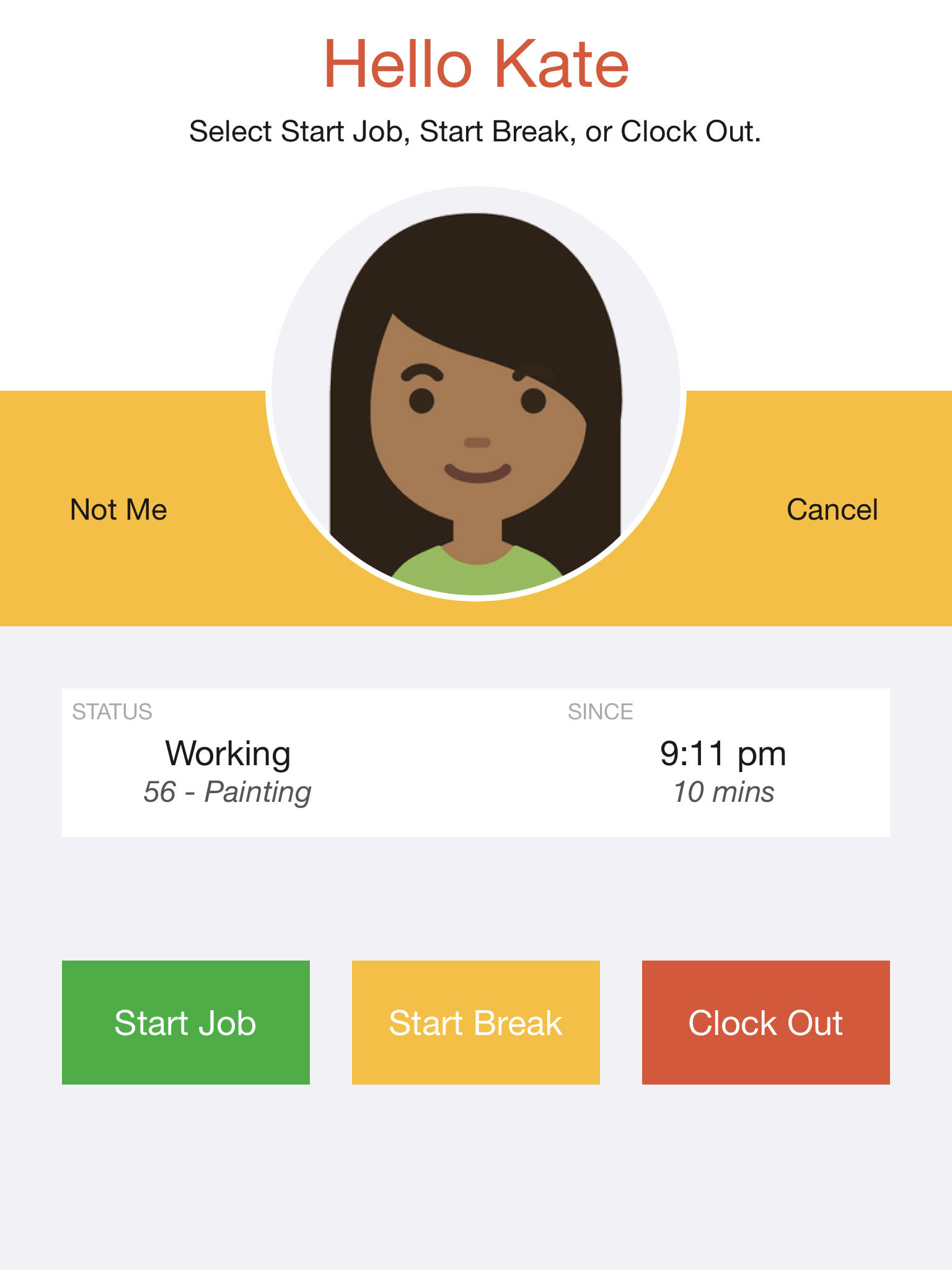
The Clock In/Out screen is used by shift workers to clock in to and clock out from a workplace. This allows you to pay staff accurately for the number of hours worked.
The Clock In/Out screen has two buttons as follows:
The text on the buttons can be changed by specifying the "in" and "out" options in the screen details. For example:
in=Start Shift, out=End Shift
The Clock In/Out screen can be further configured to allow you to collect data during your clock in and clock out events. For example, you might want to:
For more information, see: Clock In/Out Data Entry.
The Clock In/Out screen displays the available actions (eg: Clock In, Start Break, Clock Out) depending on the current work status and the Clock In/Out Mode.
You can specify the "max" length of a shift in hours, which defaults to 15 hours, or a specific time of day that all shifts should "end". If a staff member forgets to clock out from a shift, this enables them to clock into their next shift. For example:
mode=auto, max=15, end=23:00
You can validate that employees are allowed to clock in and deny them access when appropriate. The "minbreak" option specifies the minimum duration (in minutes) of an unpaid break such as a meal break; the "minrest" option specifies the minimum duration (in minutes) of a rest break; and the "minout" option specifies the minimum duration of a break between shifts. For example:
mode=break, minbreak=30
In all except "manual" and "notouch" modes, a status panel will display the current clocking status, and if you are currently clocked in, how long you have been working. You can optionally hide the calculated time by specifying:
hidetime=true
The current clocking status is determined by examining past events recorded on the device, which is incredibly fast and enables offline operation. However, it only works if staff always clock in and out on the same device. If you need to support staff clocking in and out on a different devices, and you are prepared to accept much slower clocking performance, you can specify the "share" option. You can also specify the maximum time (in seconds) that staff should wait before falling back to manual clocking. For example:
share=true, wait=5
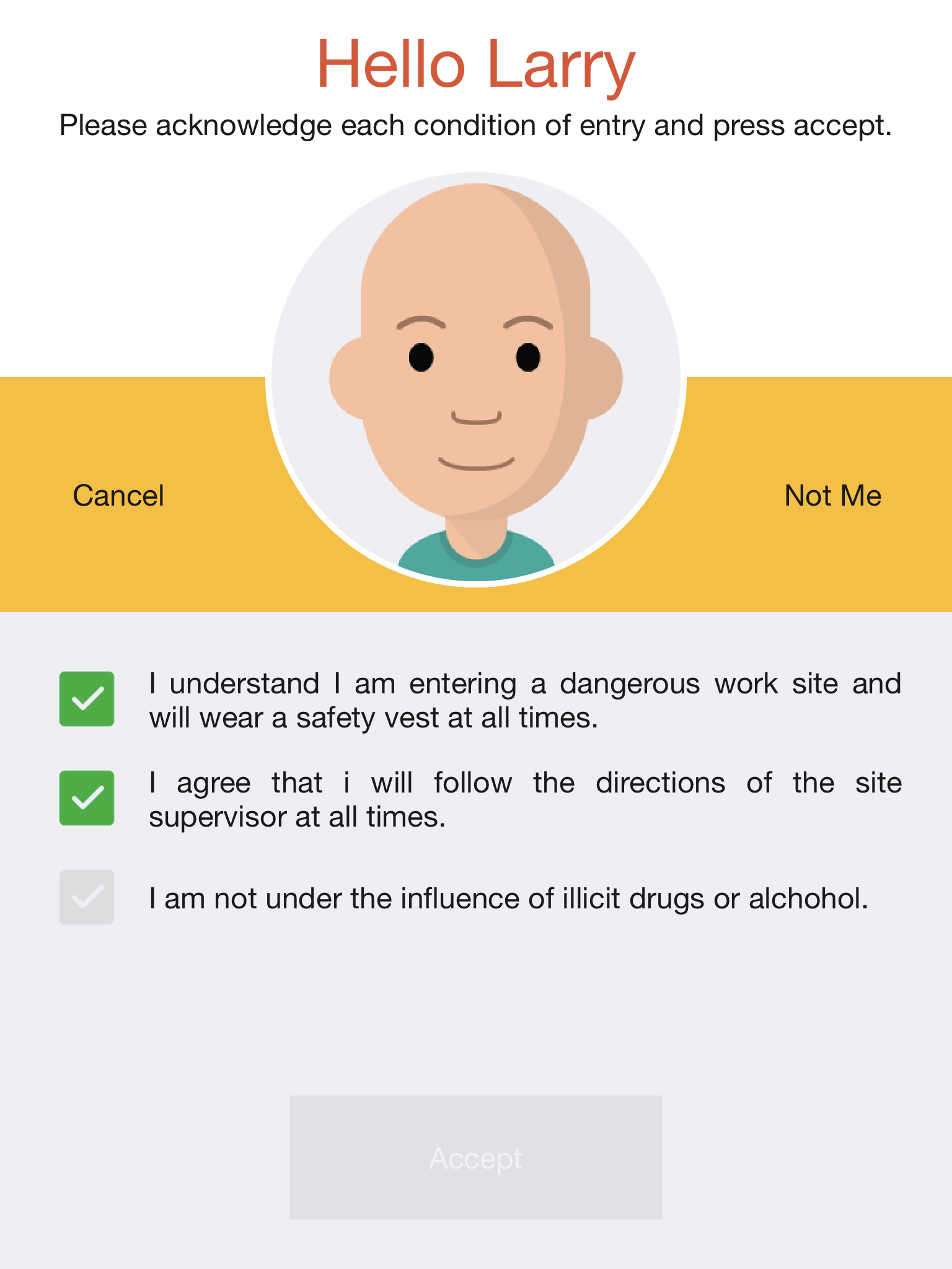
The Clock In/Out screen supports displaying a set of policies or work conditions during clock in. These policies support a subset of the functionality available in the Compliance screen. Specifically, only tick box and Web page style policies are supported. For example:
name=work condition, button=confirm, checked=true, policies=I understand I am entering a dangerous work site and will wear a safety vest at all times.; I agree that I will follow the directions of the site supervisor at all times.; I am not under the influence of illicit drugs or alcohol.
See Feedback Icons, Expiry Dates, Alerts, and Messages for additional options.
The Compliance screen is used to ensure compliance with a set of policies or conditions of entry before granting access to a site or permitting staff to clock in. There are two modes of operation: "access" mode (the default) is used for access control applications, and "clock" mode is used for clock in/out applications. For example:
mode=clock
"Clock" mode only displays policies during clock in, and uses the same logic as "auto" mode in the Clock In/Out screen to determine whether staff are clocking in or out.
The list of policies is defined in a semi-colon separated list. For example:
policies=I understand I am entering a dangerous work site and will wear a safety vest at all times.; I agree that I will follow the directions of the site supervisor at all times.
You can configure the frequency that each policy is displayed. For example, you can display policies on every access, once per day, once per year, or even randomly. For more information, see: Policy Details.
There are three styles of policies: tick boxes (the default), yes/no questions, and Web pages. You can select your preferred style as follows:
style=yesno
style=tickbox
style=webpage
With tick box policies, each policy can be initially unticked (so the user must acknowledge each one) or ticked by specifying either:
checked=false
checked=true
With yes/no policies, the user must answer all questions, and then press a button. By default, any answer is acceptable, and the actual answers are recorded with the event. If instead you want to only allow specific answers, you can specify the acceptable answers for each question or globally. For example:
answers=yes;no;yes
answers=yes (ie: all answers must be yes)
answers=no (ie: all answers must be no)
With Web page policies, the policies should be configured as a URL (you are responsible for creating and hosting the Web page). You can optionally increase the size of the displayed Web page by specifying the "size" option as "medium" or "large". For example:
policies=https://acme.com/sitesafety, size=large
The name "policy" can be configured. For example:
policyname=condition of entry
You can restrict which users are required to acknowledge polices by specifying the "usertype" option. For example, to require that only those users with a user type of "Engineer" or "Cleaner" must acknowledge policies, you would specify:
usertype=Engineer;Cleaner
You can even display different policies for each user type. For example:
usertype=Manager:mgr;Engineer:other;Cleaner:other,
mgr=https://acme.com/mgrpolicies,
other=https://acme.com/otherpolicies
Finally, the button text can also be configured. For example:
policybutton=Confirm
See Feedback Icons, Expiry Dates, Alerts, and Messages for additional options.
A full example of using tick box style policies for Access Control is as follows:
policyname=condition of entry, policies=I understand I am entering a dangerous work site and will wear a safety vest at all times.; I agree that I will follow the directions of the site supervisor at all times.; I am not under the influence of illicit drugs or alcohol.; I will try to be happy today.
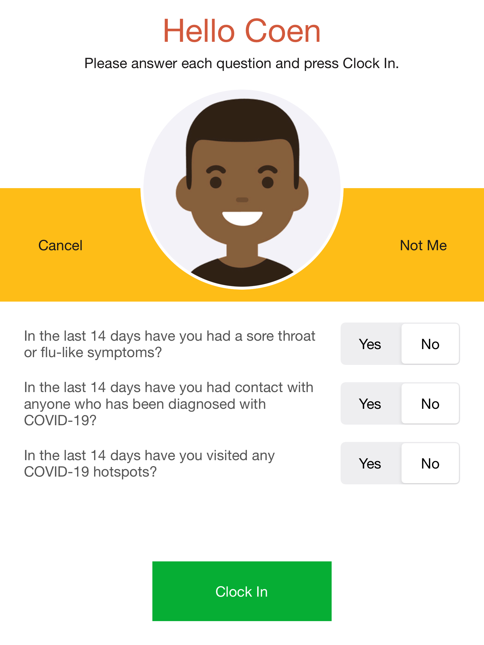
A full example of using yes/no style policies for Time and Attendance is as follows:
mode=clock, style=yesno, answers=no, policies=In the last 14 days have you had a sore throat or flu-like symptoms?; In the last 14 days have you had contact with anyone who has been diagnosed with COVID-19?; In the last 14 days have you visited any COVID-19 hotspots?
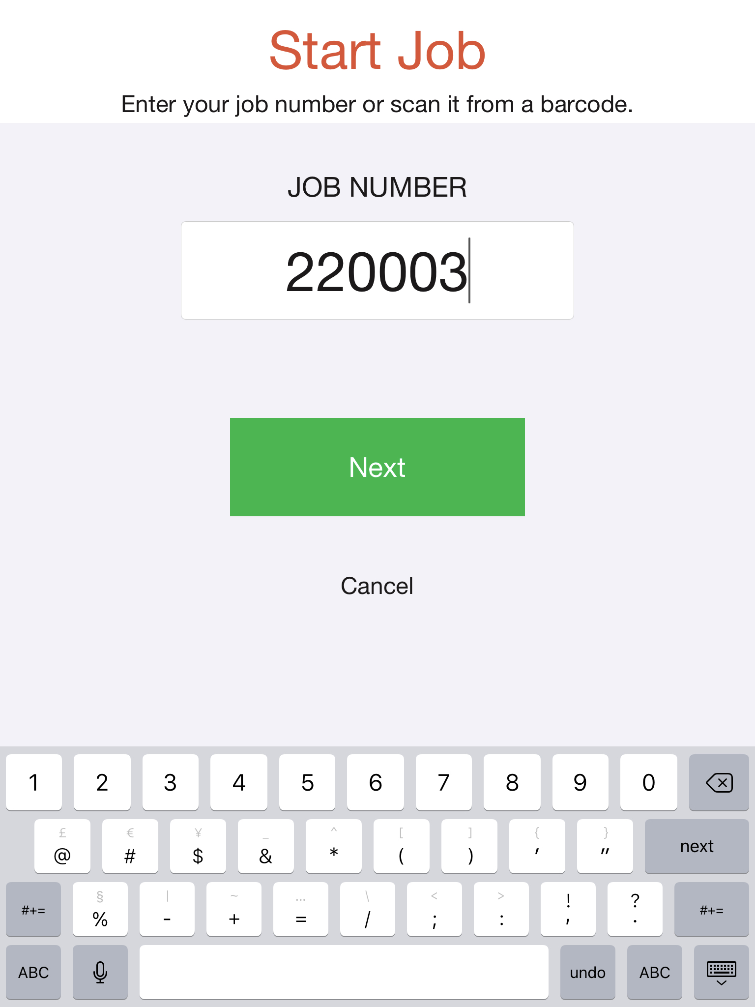
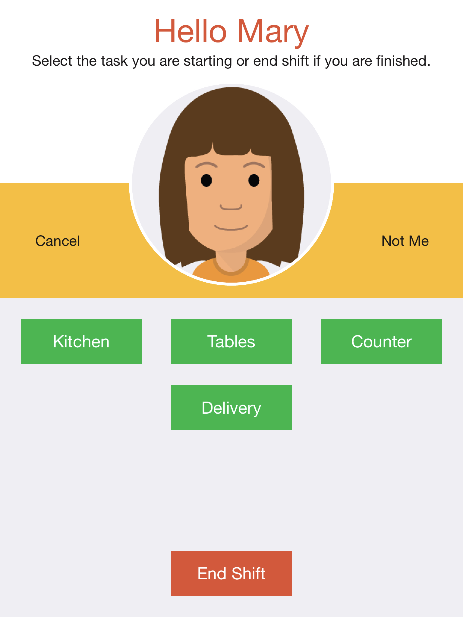
The Task Tracking screen is used to record the type of tasks being worked on throughout the day. This allows you to apply different pay rates to different task types, or to allocate costs to different departments or customers.
The Task Tracking screen will display up to nine task types as a series of buttons. If there are more than nine task types, the last button will say "OTHER..." and this will pop-up a selection window. Users are required to press one of the task buttons whenever they start a task, and the "Clock Out" button when they are finished for the day.
The Task Tracking screen displays the available tasks and actions (eg: Start Break, Clock Out) depending on the current work status and the Task Tracking Mode.
The list of tasks can be configured by specifying the "tasks" option in the screen details. List items are semi-colon separated, and can be either just a name or a name and a corresponding value (colon separated). For example:
tasks=Kitchen:20; Counter; Tables:30
You can optionally override your task list by user type eg:
Driver=Delivery, Chef=Kitchen, Waitstaff=Counter;Tables
You can also specify that only specific user types are required to select tasks (with all others using no touch clocking):
tasktype=Waitstaff
If you are synchronising your users with a system that supports global lists, you can specify your tasks by providing the appropriate list number. For example:
tasks=$2
You can change the terminology of "task" to something else by specifying the "name" option in the screen details.
name=Project
You can specify an additional task for default or unassigned work. For example:
notask=No Project
You can change the text on the Clock Out button by specifying the "out" option in the screen details. For example:
out=End Shift
You can hide the Clock Out button altogether by specifying the "hideout" option in the screen details. If you do this, the maximum number of visible task buttons increases from nine to twelve. For example:
hideout=true
The Task Tracking screen supports displaying a set of policies or work conditions when starting tasks. These policies support a subset of the functionality available in the Compliance screen. Specifically, only tick box and Web page style policies are supported.
See Feedback Icons, Expiry Dates, and Alerts for additional options.
A full example is as follows:
tasks=Kitchen; Tables; Counter; Delivery, mode=auto
The Temperature screen is used when the primary purpose is to screen people for elevated temperatures before they enter your premises. It can simultaneously be used for both unknown people (eg: visitors or customers) and known people (eg: staff).
The Temperature screen reads a person's temperature and then displays either the Normal Temperature screen or the Elevated Temperature screen as appropriate. If the person is recognised, they will be greeted by name, otherwise a "Register" button will be visible at the bottom of the screen. You can hide the "Register" button by specifying the "hidereg" screen option in the screen details. For example:
hidereg=true
The elevated temperature threshold and message can be configured for each kiosk (in your access point type settings). To change the message for very cold temperature readings, specify the "coldmsg" option in the screen details. To change the greeting for normal temperature readings, specify the "greeting" option in the screen details. For example:
greeting=You may now proceed.
To display the actual temperature (instead of "Normal" or "Elevated") specify the "reading" option in the screen details. This is generally only advisable for demonstrations, for privacy reasons. For example:
reading=true
To trigger the receiver on each event, specify the "receiver" option in the screen details. This can be triggered on "normal" temperature events, "elevated" temperature events, or "all". For example:
receiver=elevated
You can optionally display a QR Code as part of the user feedback. This allows you to direct visitors to a custom screen to collect additional information, passing temperature data to it. For more information, see: Temperature QR Codes.
A full example is as follows:
icons=usertick;cross;usercross, receiver=normal


The Visitor Registration screen is used to collect and record visitor details when they enter your premises. Employees can also use it to clock in and clock out of the workplace. This allows you to know exactly who is on site - both employees and visitors. If you have a dedicated kiosk that is used only for Visitor Registration, you can disable employee registration by specifying the "hidereg" option. For example:
hidereg=true
The Visitor Registration screen automatically adopts the colours of your uploaded home screen image (usually your company logo). You can customise the colours by specifying the "primary" and "secondary" options in #RRGGBB format. For example:
primary=#007799, secondary=#FF2100
The welcome message will default to "Welcome to X", where "X" is replaced with your organisation name. You can change this message by specifying the "welcome" option. For example:
welcome=Greetings from NoahFace
By default, the visitors name and phone number will be required. You can make the phone number optional by specifying the "nophone" option. You can optionally require a company name by specifying the "type" option and a license number by specifying the "card" option. For example:
nophone=true, type=company, card=license
The text on the Sign In, Sign Out, Confirm, and Register buttons can be configured by specifying the "in", "out", "confirm", and "reg" options respectively. For example:
in=Check In, out=Check Out, confirm=Done, reg=Register
The Sign Out process can be changed from a pick list to phone number entry by specifying the "outmode" option. For example:
outmode=phone
Or, the Sign Out button can be completely hidden by specifying the "hideout" option. For example:
hideout=true
Any users that are not visitors will be available for selection as a host. To restrict the host selection screen to only include Managers, you can can specify the "hostrole" option. For example:
hostrole=Manager
And to completely hide the host selection screen, you can specify the "hidehost" option. For example:
hidehost=true
You can add screening questions to your Visitor Registration flow. For more information, see: Screening Questions.
If you are using Temperature Screening in conjunction with Visitor Registration, an introductory screen is displayed. The text on this screen can be configured by specifying the "intromsg" option, and the number of seconds this screen is displayed can be configured by specifying the "introsecs" option (set this to 0 to disable this screen completely). For example:
intromsg=Stand by for temperature testing., introsecs=3
To specify more than one option, just comma separate the options. For example:
welcome=Greetings from NoahFace, type=organisation


The NoahFace App displays feedback to the user when an action is performed:
It is possible to configure these feedback icons by specifying the "icons" option in your screen details. You can specify up to three semi-colon separated values, indicating the icons that should be used for positive, negative, and elevated temperature feedback respectively. The following options are available:
For example:
icons=tick; cross; temp
icons=temptick; tempcross; tempcross
icons=tick; lock
icons=usertick; usercross; usertemp
Note that the "usertick", "usercross", "usertemp", and "userlock" options are only available when using the Temperature and Visitor Registration screens.


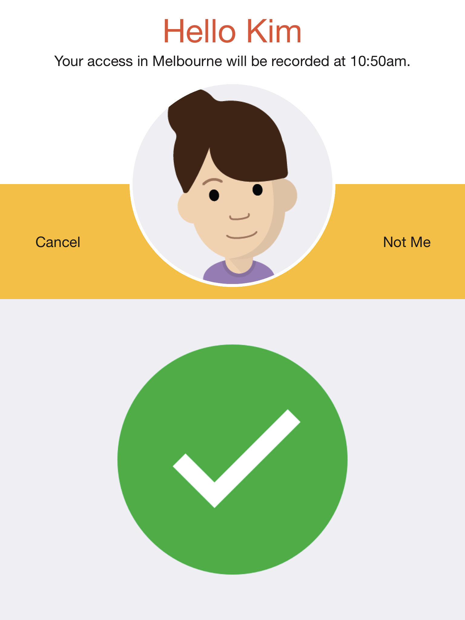
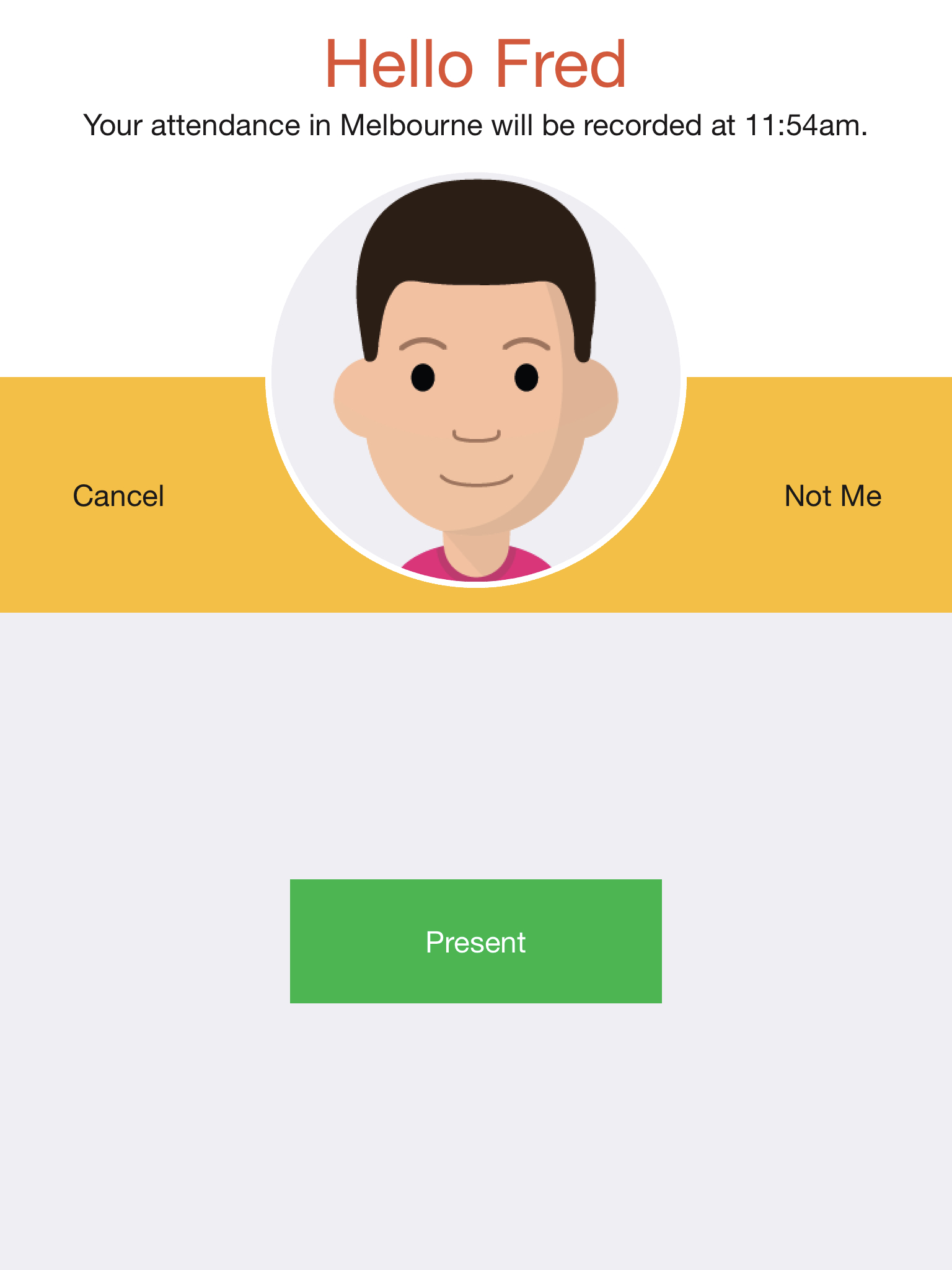
The message at the top of the screen can be changed for the Access Control, Attendance, Compliance, and Clock In/Out (in notouch mode) screens by specifying the "message" option. You can substitute data elements into your message by including any of the following:
For example:
message=Your #EVENT will be recorded at #TIME. Have a great day!
message=Your temperature is #READING. Have a great day!
NoahFace allows you to record a date for each user which can be used for a number of purposes, including:
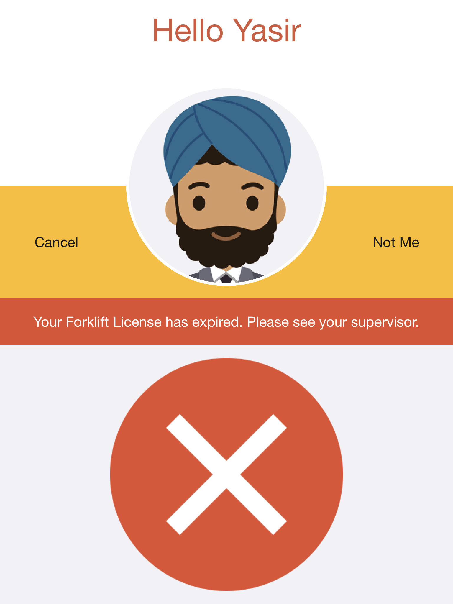
There are four expiry modes that can selected by specifying the "expmode" option. With the default mode of "future", users are only granted access on or before an expiry date (eg: a license expiry date). With a mode of "today", users are only granted access on a specified date that is regularly updated (eg: the next rostered shift date). With a mode of "past", users are only granted access for a defined period after a specified date (eg: a training date or a vaccine date). Finally, with a mode of "annual", users are delivered a message on the anniversary of a specified date (eg: on their birthday or work anniversary).
For past expiry dates, you can define the number of days they are valid by specifying the "expdays" option, which defaults to 7. For example:
expmode=past, expdays=90
For both past and future expiry dates, you can optionally provide a pre-warning to users in advance of their access expiry. To do this, just specify the number of days in advance you want that pre-warning to be presented in the "expwarn" option. For example:
expmode=future, expwarn=30
All expiry date messages include both a warning component (eg: "Your access has expired.") and an expected action (eg: "Please see your supervisor."). You can configure these by specifying the "skill" and "action" options respectively. For example:
skill=Forklift License, action=Please renew it ASAP.
You can also indicate that you want the expiry date to be refreshed in real time before a warning or error is displayed, by specifying the "expsync" option. Refreshing the expiry date requires an active network connection. For example:
expsync=true
The access expiry options can be used on all screens except for the Visitor Registration and Temperature screens, and can be combined together with other options by comma separating the options.
NoahFace can display alerts when users present themselves. This can be used for a number of purposes, including:
To specify an alert that should be delivered to all users, specify the "alert" option. For example:
alert=A reminder that the company wide meeting is at 3pm.
To specify an alert that should only be delivered to users with a specific user type, specify the "alerttype" option. For example:
alert=Please conduct employee safety briefings this week.,
alerttype=Supervisor
To specify an alert that should only be delivered to an individual user, specify the "alert" option as a hashed attribute. For example:
alert=#usermsg
In this case, the current alert for each individual user must be provided through your user synchronisation.

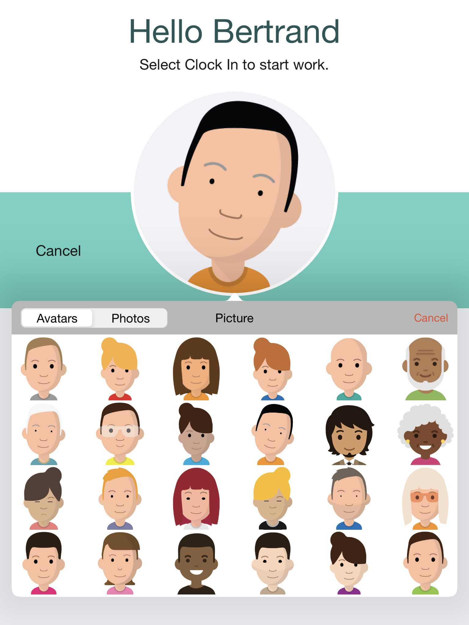
NoahFace allows you to select your profile picture as either an avatar or a photo. You can restrict the options available to users by specifying the "pictures" option as "all", "avatars", "photos", or "none". For example:
pictures=photos
NoahFace can be configured to use custom colours by specifying the "primary" and "secondary" options in #RRGGBB format. For example:
primary=#68D2C4, secondary=#245756
It is recommend that your primary colour is light, and your secondary colour is dark.